ATypI Conference – Day Three
I found the fact the conference only had single-track lectures very comfortable. No dilemma whom to prefer. I was also pretty satisfied with the idea od 20-minute lectures, it led to a speakers’ briefness. During the third (and last) day I presented my collection of posters from the 1989 Velvet revolution.
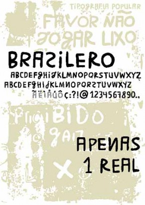
Two morning lectures were about Brazilian vernacular typography. Priscila Farias took scientific approach to analyze and classify diverse lettering found on shops or signs. The hand lettering tradition is still alive in Latin America, compared to Europe where self adhesive foils are used everywhere. In Brazil, a brush or spray is the tool. Crystian Cruz then introduced his font Brasilêro based on shapes typical for Brazilian hand lettering. He also announced upcoming OpenType version of this font enhanced with many alternatives and special features.

Brasilêro
Gonzalo Garcia Barcha described the process of creating an unique book, a journal/sketchbook by contemporary Spanish artist Miquel Barceló.It was a great presentation about a birth of a bibliophil book printed many different techniques, about searching of an appropriate form, binding, paper or typefaces. One of the few lectures about typeface in the context of graphic design.
A presentation by an Austrian typographer Wolfgang Homola was short but inspiring. Homola talked about his task at design studio Walter Bohatsch — to design a typeface for signage system in the Arbeiterskammer building in Vienna. He collected all the existing signage letter by letter, digitized it and sorted. Then he added missing capital letters followed by carefully drawn lowercase ones. The result is surprisingly superior typeface sharing some attributes with Futura or Avenir, but far more universal. It works well in signage as well as in smaller text sizes. I hope Wolfgang will release the font one day.
The official program of ATypI ended by the third day. During Thursday and Friday, lectures, workshop and discussions continued in special track focused on type on web, non-latin typography etc. And of course, the debates and parties continued in downtown bars and restaurants, Lucha Libre fights enchanted many of us and so did the trips to the ancient places around Mexico City.
The Typ09 conference was great. The astonishing atrium with 16 screens in the Centro Histórico, brilliant lectures, tasty luncheons at the platform with the Zócalo view… Anyway, I find myself thinking about the future of the ATypI conferences in the internet era. We should focus on discussions. Unfortunately, the program was so dense, almost without breaks, so we didn’t have a chance to ask questions. I would rather get over the loss of some talks summarizing known facts or information one can quickly find on the net to get more time for the discussion. The main reason of the ATypI annual meatings is to meet and talk to colleagues, isn’t it? Next time, we should add more time for the debates. I will do my best to push this change ahead.
Add Comment
Author’s latest articles
- TyPoll – Typo Survey 19. 12. 2012
- Trnava Poster Triennial 2012 10. 4. 2012
- Type Specimen for iPad 24. 2. 2011
- European Design Awards 2011 – call for entries 11. 1. 2011
- Austrian Design in Prague 21. 11. 2010


 Filip Blažek

Comments (0)